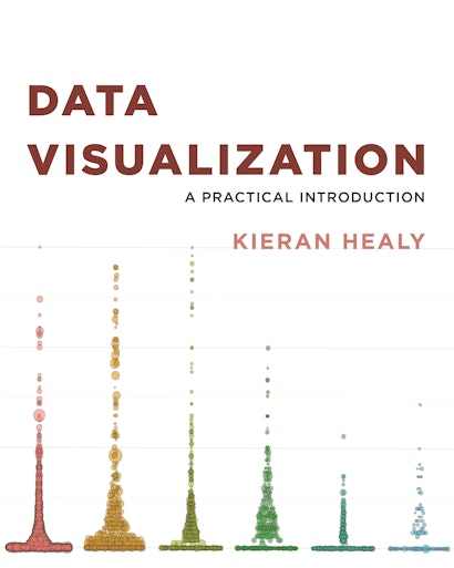
This book provides students and researchers a hands-on introduction to the principles and practice of data visualization. It explains what makes some graphs succeed while others fail, how to make high-quality figures from data using powerful and reproducible methods, and how to think about data visualization in an honest and effective way.
Data Visualization builds the reader’s expertise in ggplot2, a versatile visualization library for the R programming language. Through a series of worked examples, this accessible primer then demonstrates how to create plots piece by piece, beginning with summaries of single variables and moving on to more complex graphics. Topics include plotting continuous and categorical variables; layering information on graphics; producing effective “small multiple” plots; grouping, summarizing, and transforming data for plotting; creating maps; working with the output of statistical models; and refining plots to make them more comprehensible.
Effective graphics are essential to communicating ideas and a great way to better understand data. This book provides the practical skills students and practitioners need to visualize quantitative data and get the most out of their research findings.
- Provides hands-on instruction using R and ggplot2
- Shows how the “tidyverse” of data analysis tools makes working with R easier and more consistent
- Includes a library of data sets, code, and functions
Kieran Healy is associate professor of sociology at Duke University. He is the author of Last Best Gifts: Altruism and the Market for Human Blood and Organs.
- Preface
- What You Will Learn
- The Right Frame of Mind
- How to Use This Book
- Conventions
- Before You Begin
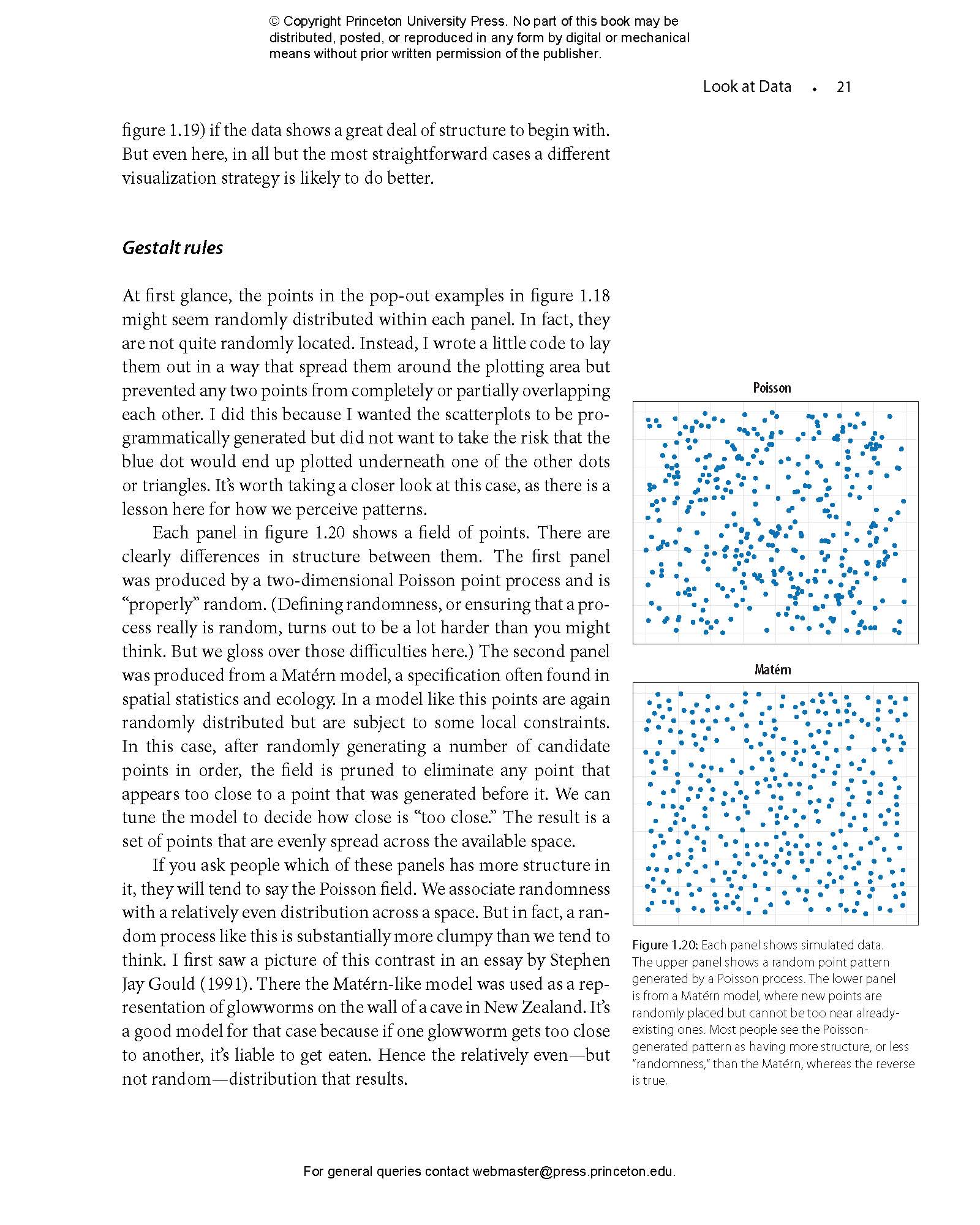
- 1 Look at Data
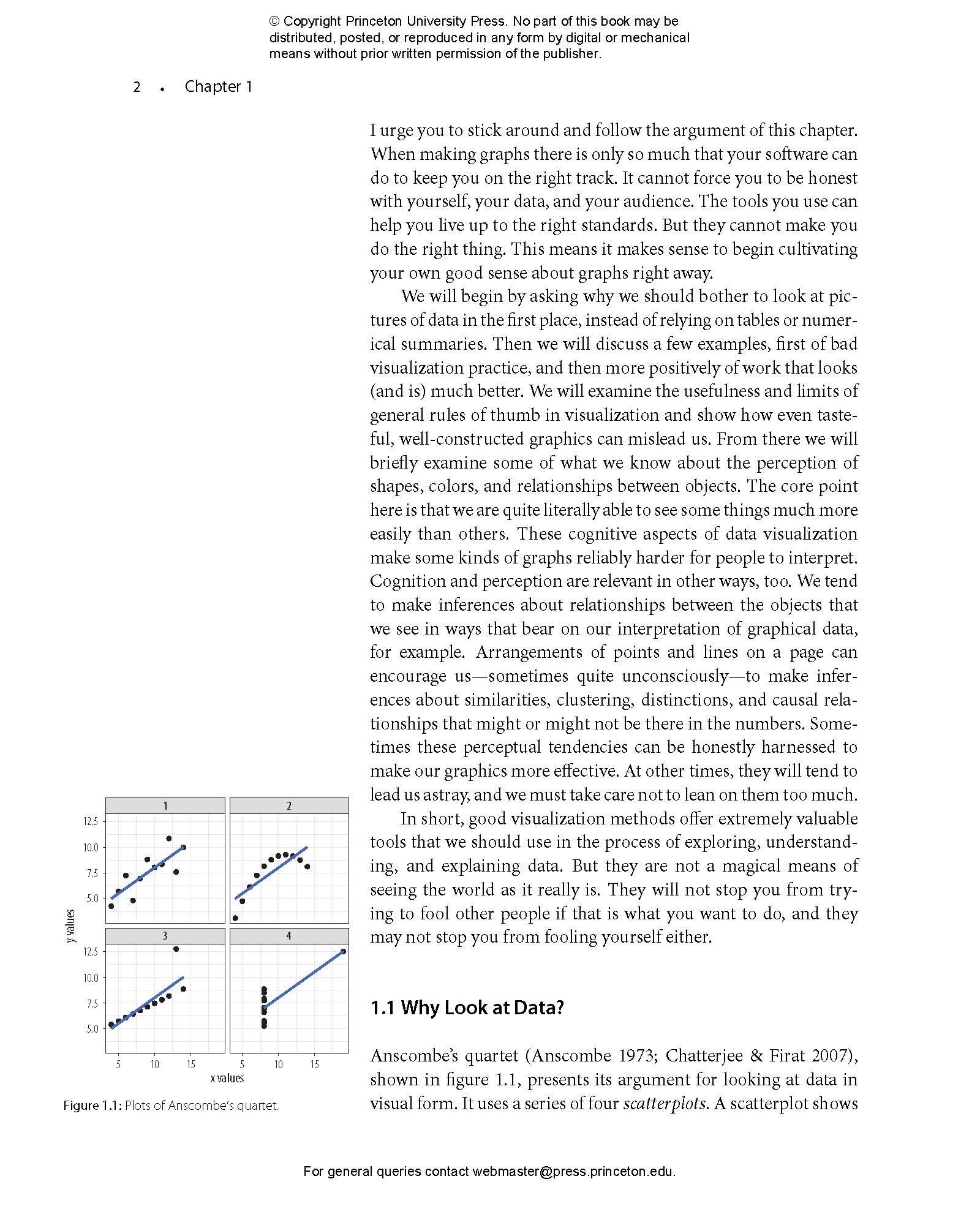
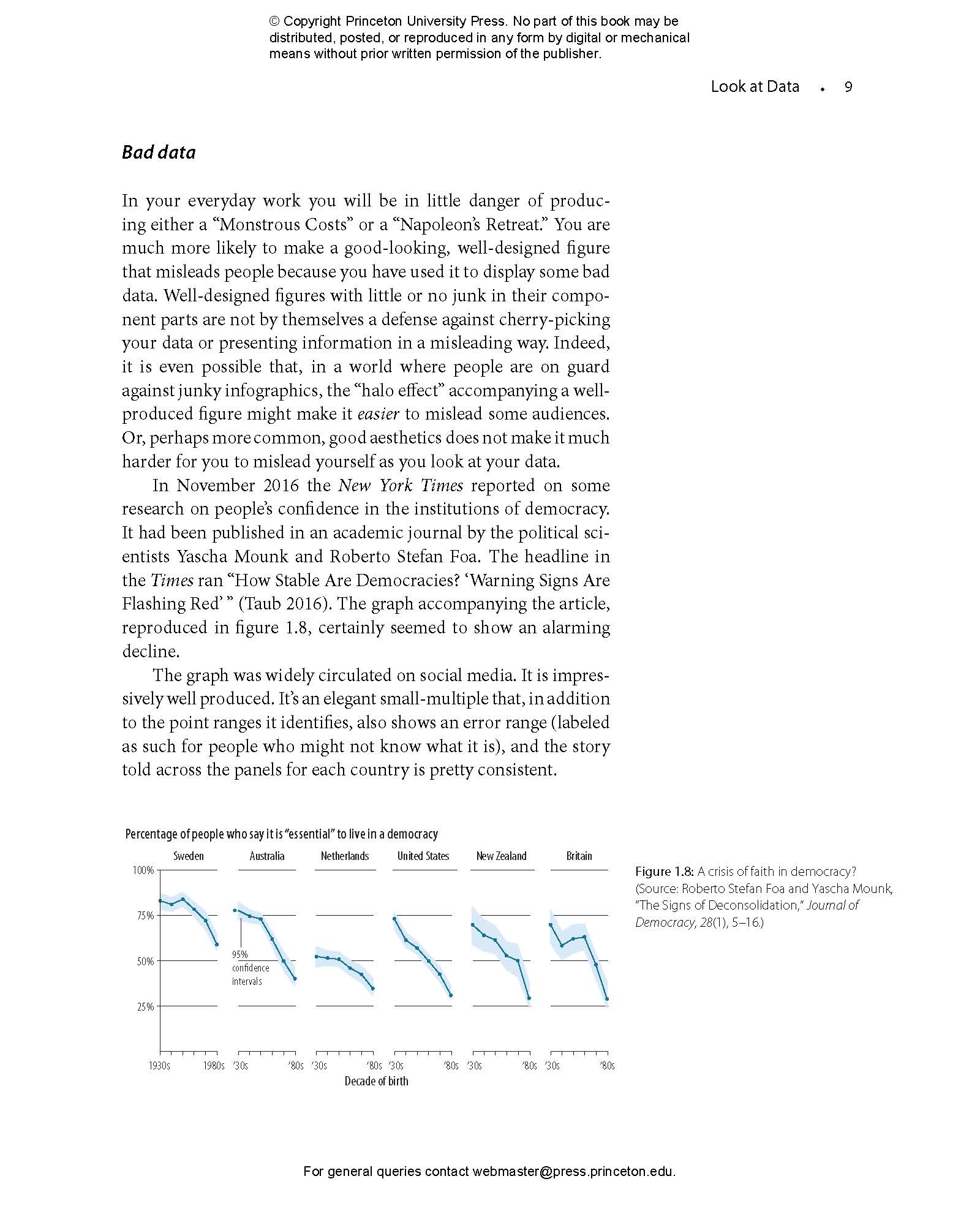
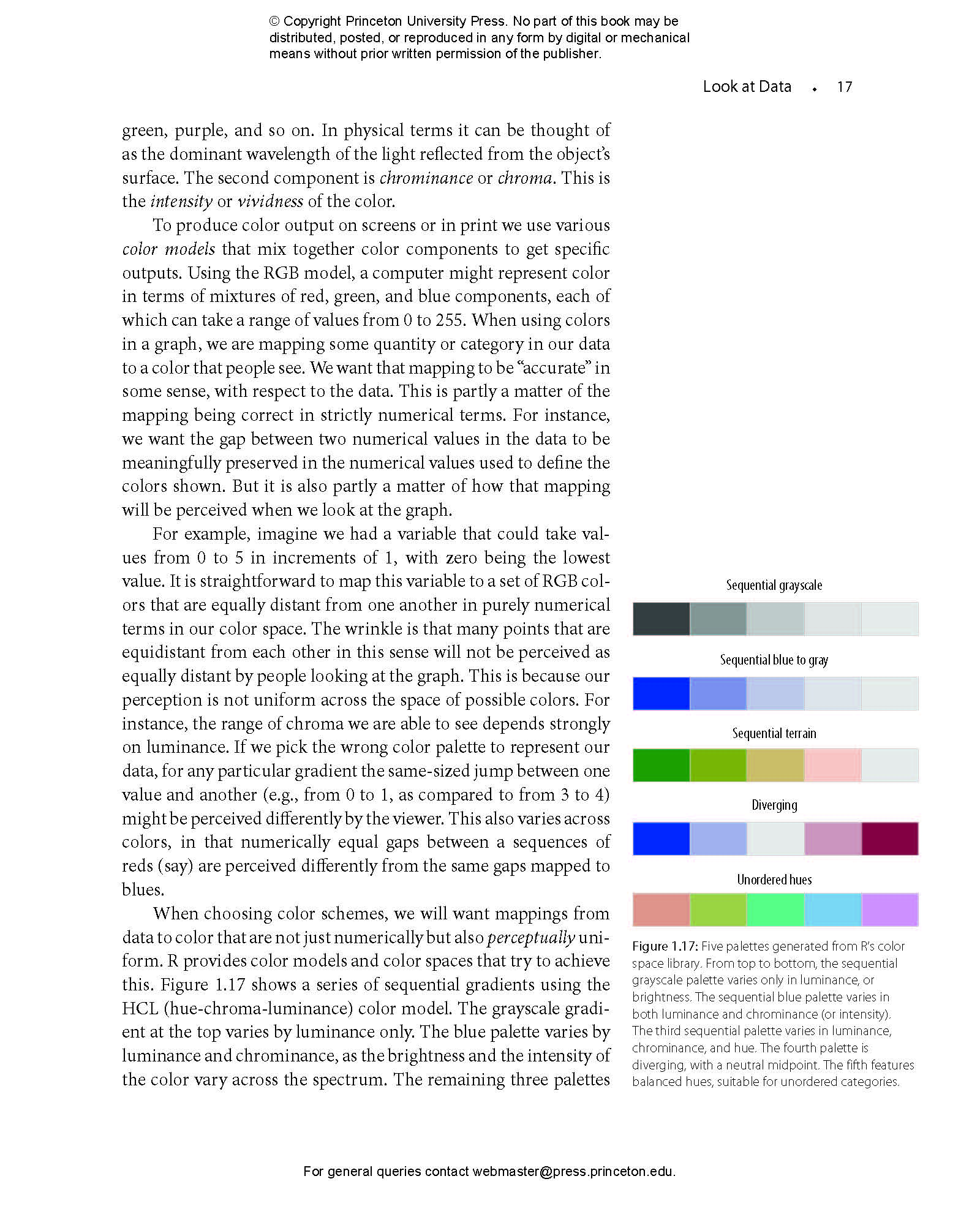
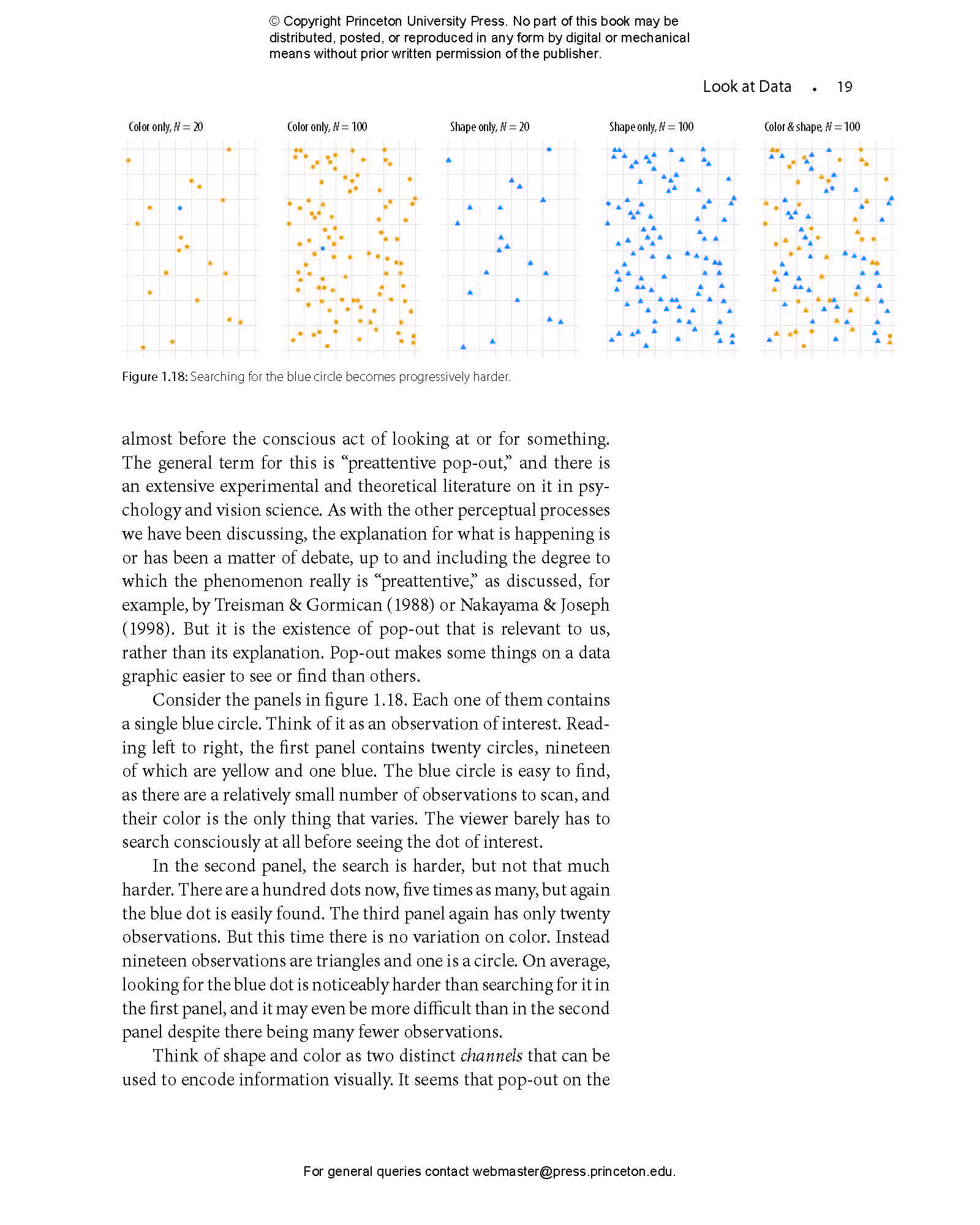
- 1.1 Why Look at Data?
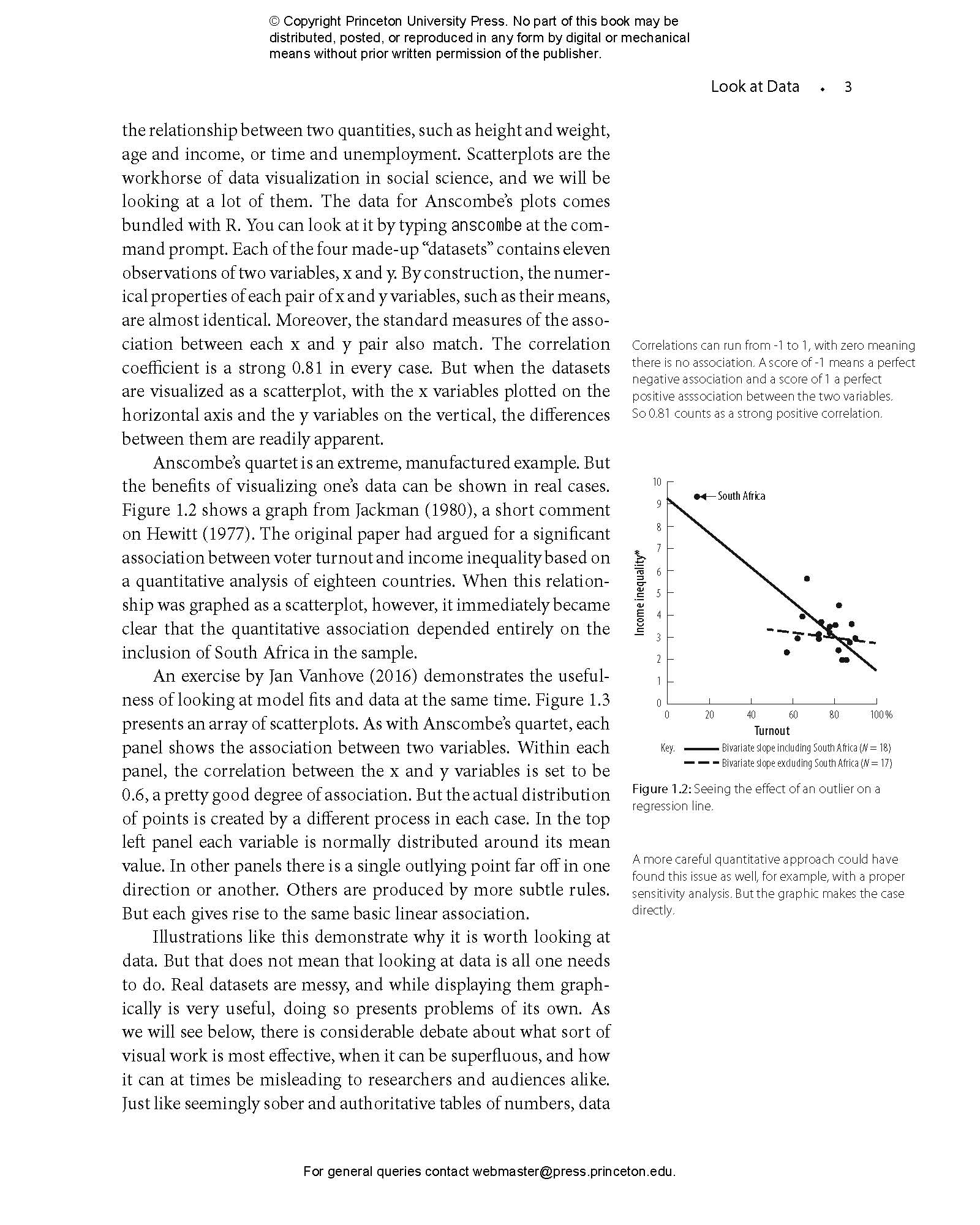
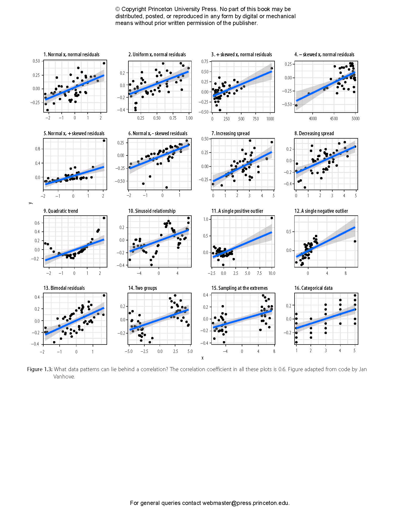
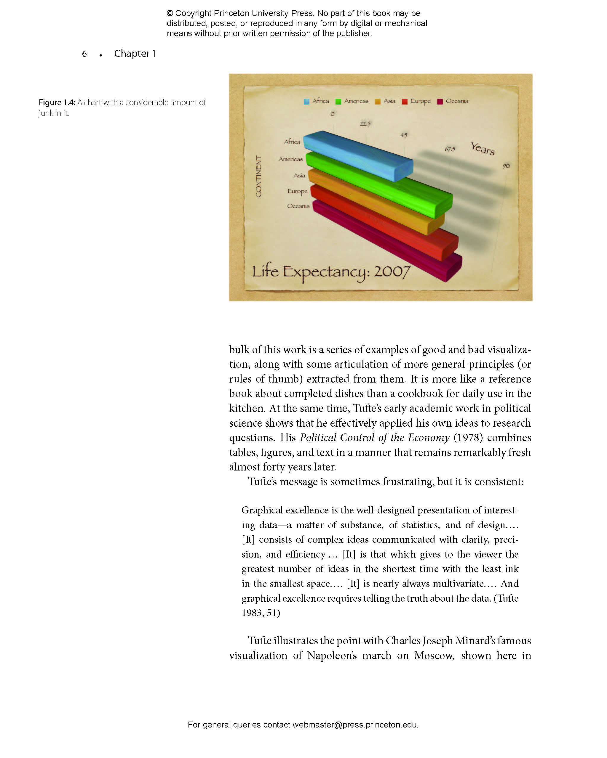
- 1.2 What Makes Bad Figures Bad?
- 1.3 Perception and Data Visualization
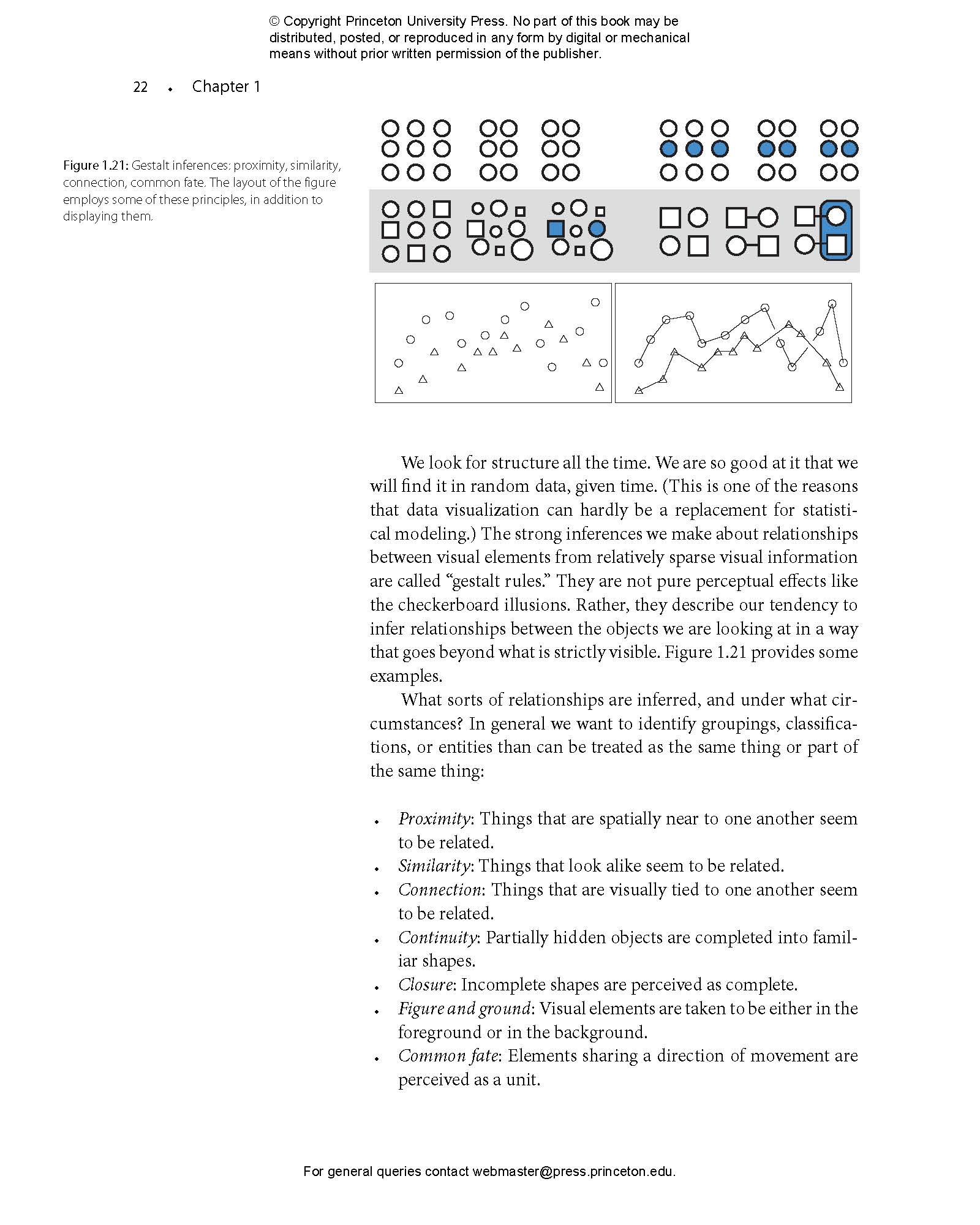
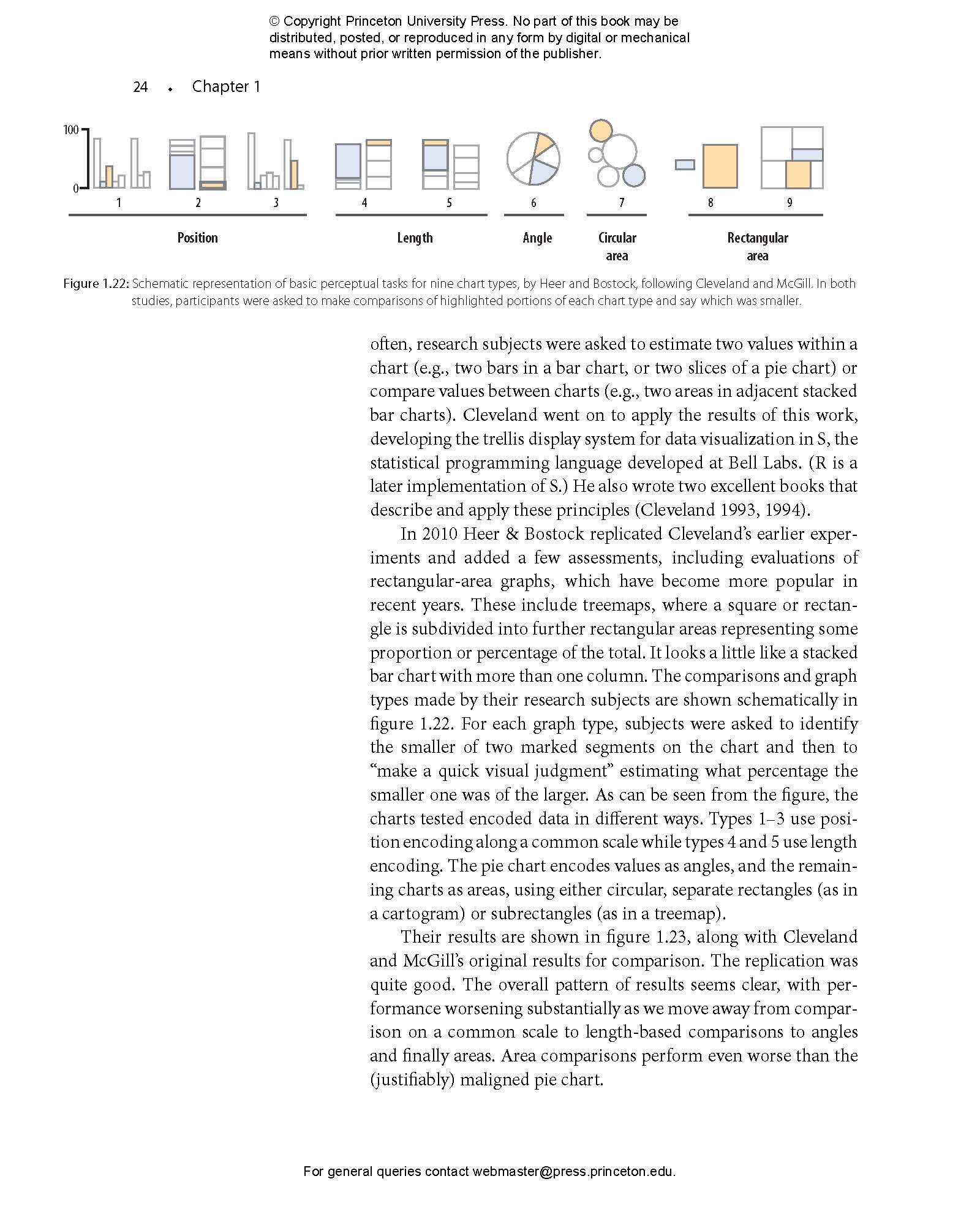
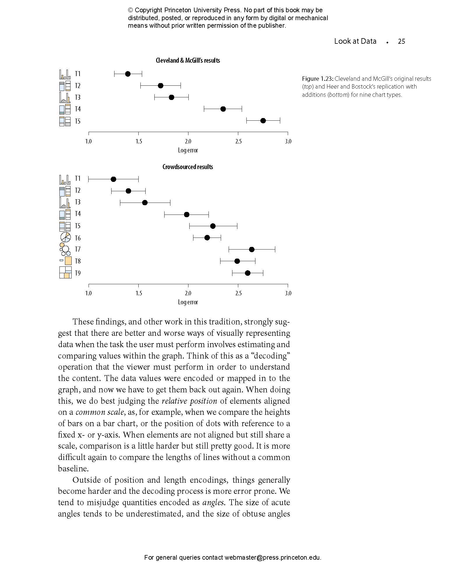
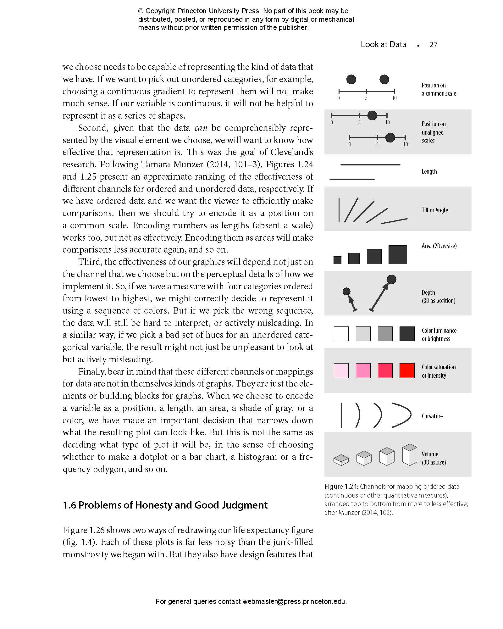
- 1.4 Visual Tasks and Decoding Graphs
- 1.5 Channels for Representing Data
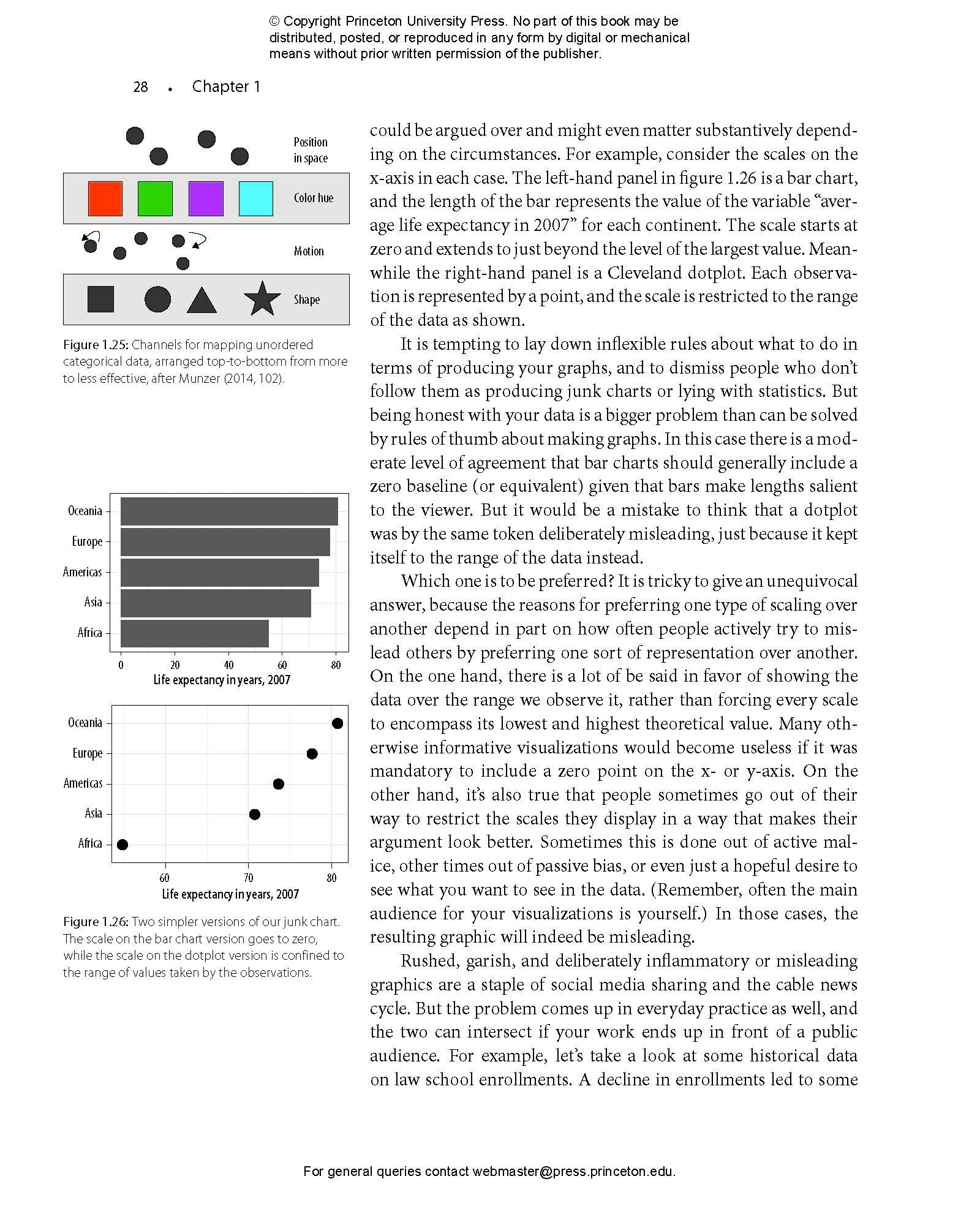
- 1.6 Problems of Honesty and Good Judgment
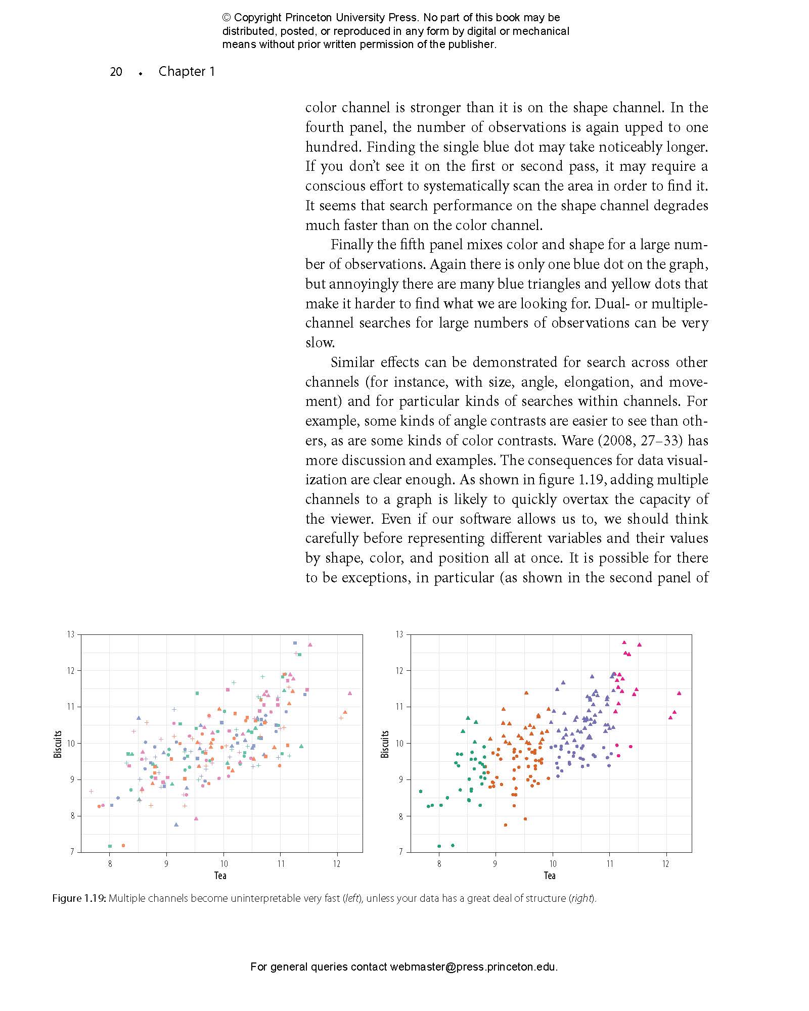
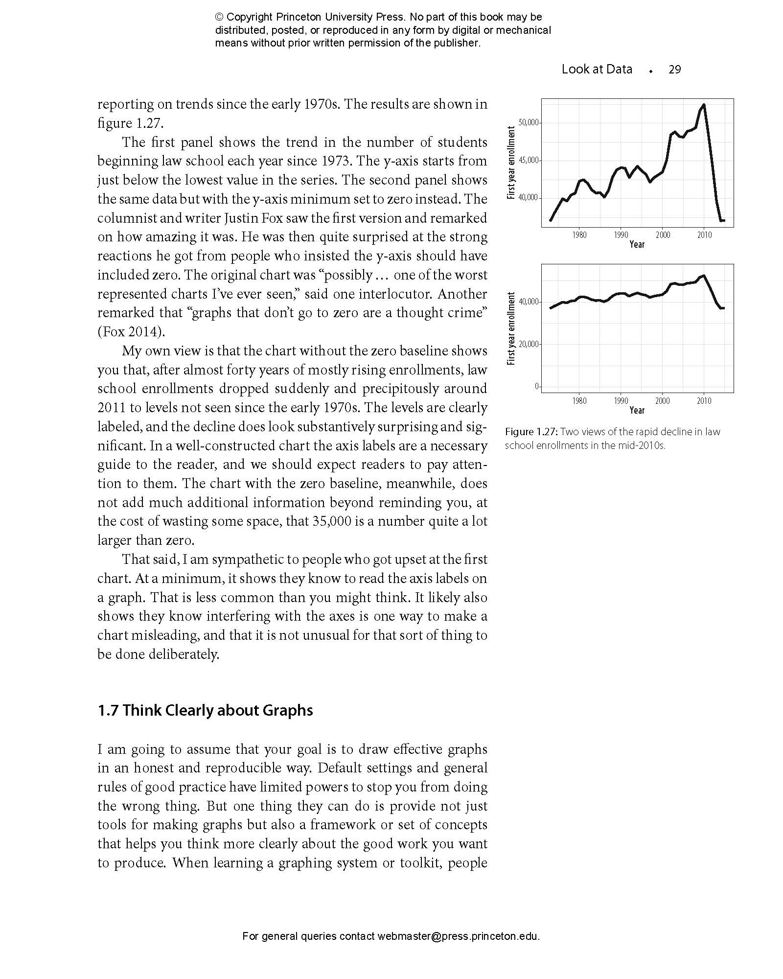
- 1.7 Think Clearly about Graphs
- 1.8 Where to Go Next
- 2 Get Started
- 2.1 Work in Plain Text, Using RMarkdown
- 2.2 Use R with RStudio
- 2.3 Things to Know about R
- 2.4 Be Patient with R, and with Yourself
- 2.5 Get Data into R
- 2.6 Make Your First Figure
- 2.7 Where to Go Next
- 3 Make a Plot
- 3.1 How Ggplot Works
- 3.2 Tidy Data
- 3.3 Mappings Link Data to Things You See
- 3.4 Build Your Plots Layer by Layer
- 3.5 Mapping Aesthetics vs Setting Them
- 3.6 Aesthetics Can Be Mapped per Geom
- 3.7 Save Your Work
- 3.8 Where to Go Next
- 4 Show the Right Numbers
- 4.1 Colorless Green Data Sleeps Furiously
- 4.2 Grouped Data and the “Group” Aesthetic
- 4.3 Facet to Make Small Multiples
- 4.4 Geoms Can Transform Data
- 4.5 Frequency Plots the Slightly Awkward Way
- 4.6 Histograms and Density Plots
- 4.7 Avoid Transformations When Necessary
- 4.8 Where to Go Next
- 5 Graph Tables, Add Labels, Make Notes
- 5.1 Use Pipes to Summarize Data
- 5.2 Continuous Variables by Group or Category
- 5.3 Plot Text Directly
- 5.4 Label Outliers
- 5.5 Write and Draw in the Plot Area
- 5.6 Understanding Scales, Guides, and Themes
- 5.7 Where to Go Next
- 6 Work with Models
- 6.1 Show Several Fits at Once, with a Legend
- 6.2 Look Inside Model Objects
- 6.3 Get Model-Based Graphics Right
- 6.4 Generate Predictions to Graph
- 6.5 Tidy Model Objects with Broom
- 6.6 Grouped Analysis and List Columns
- 6.7 Plot Marginal Effects
- 6.8 Plots from Complex Surveys
- 6.9 Where to Go Next
- 7 Draw Maps
- 7.1 Map U.S. State-Level Data
- 7.2 America’s Ur-choropleths
- 7.3 Statebins
- 7.4 Small-Multiple Maps
- 7.5 Is Your Data Really Spatial?
- 7.6 Where to Go Next
- 8 Refine Your Plots
- 8.1 Use Color to Your Advantage
- 8.2 Layer Color and Text Together
- 8.3 Change the Appearance of Plots with Themes
- 8.4 Use Theme Elements in a Substantive Way
- 8.5 Case Studies
- 8.6 Where to Go Next
- Acknowledgments
- Appendix
- 1 A Little More about R
- 2 Common Problems Reading in Data
- 3 Managing Projects and Files
- 4 Some Features of This Book
- References
- Index
"[Healy’s] prose is engaging and chatty, and the style of instruction is unpretentious and practical . . . This single volume represents an excellent entry point for those wishing to upskill their abilities in data visualization."—Paul Cuffe, IEEE Transactions
"Undoubtedly, this book is an excellent introduction to an essential tool for anyone who needs to collect and present data."—Conservation Biology
“Finally! A data visualization guide that is simultaneously practical and elegant. Healy combines the beauty and insight of Tufte with the concrete helpfulness of Stack Exchange. Data Visualization is brimming with insights into how quantitative analysts can use visualization as a tool for understanding and communication. A must-read for anyone who works with data.”—Elizabeth Bruch, University of Michigan
“Healy’s fun and readable book is unusual in covering the ‘why do’ as well as the ‘how to’ of data visualization, demonstrating how dataviz is a key step in all stages of social science—from theory construction to measurement to modeling and interpretation of analyses—and giving readers the tools to integrate visualization into their own work.”—Andrew Gelman, author of Red State, Blue State, Rich State, Poor State: Why Americans Vote the Way They Do
“Data Visualization is a brilliant book that not only teaches the reader how to visualize data but also carefully considers why data visualization is essential for good social science. The book is broadly relevant, beautifully rendered, and engagingly written. It is easily accessible for students at any level and will be an incredible teaching resource for courses on research methods, statistics, and data visualization. It is packed full of clear-headed and sage insights.”—Becky Pettit, University of Texas at Austin
“Healy provides a unique introduction to the process of visualizing quantitative data, offering a remarkably coherent treatment that will appeal to novices and advanced analysts alike. There is no other book quite like this.”—Thomas J. Leeper, London School of Economics
“Kieran Healy has written a wonderful book that fills an important niche in an increasingly crowded landscape of materials about software in R. Data Visualization is clear, beautifully formatted, and full of careful insights.”—Brandon Stewart, 91��ɫ University
“Healy’s prose is clear and direct. I came away from this book with a much better understanding of both visualizations and R.”—Neal Caren, University of North Carolina, Chapel Hill
“Innovative and extraordinarily well-written.”—Jeremy Freese, Stanford University
No known hazards or warnings
Accessibility Features
-
Inaccessible, or known limited accessibility
-
No known hazards or warnings